Webinars are a powerful tool for marketers across a wide range of industries. They connect you with your audience in a way that your average blog post or social update just can’t pull off. And, when done right, webinars can help you establish yourself as a valuable resource and a thought leader.
But here’s the thing. You might have some killer sessions up your sleeve, be this really great speaker, or have some high-profile partners helping you out. But your webinar is nothing without an audience.
In this article, we’ll look at some webinar landing page examples that can help you drive the registrations needed to put your brand on the map. Let’s have a look:
What Should a Webinar Landing Page Do?
Webinar landing pages are designed to collect sign-ups for your digital event. As is the case with all types of landing pages, webinar landing pages should contain a compelling headline, benefit-focused copy, and a clear call-to-action. Visitors should be able to scan your landing page and immediately understand what it’s about and why it’s worth their time.
Because companies often host webinars so that they can capture leads, you’ll need to strike a balance between making the sign up easy and collecting enough information to sell to this person later on. Consider whether your goal is to cast a wide net or focus on a select group of experts. If it’s the latter, you’ll be able to get away with a few more form fields. Otherwise, keep it short.
Get Straight to the Point
This landing page for CrowdCompass gets down to business. There’s a bold headline, a short intro paragraph and a few bullet points that give potential registrants an idea of what to expect. There’s plenty of white space and information about the speaker.
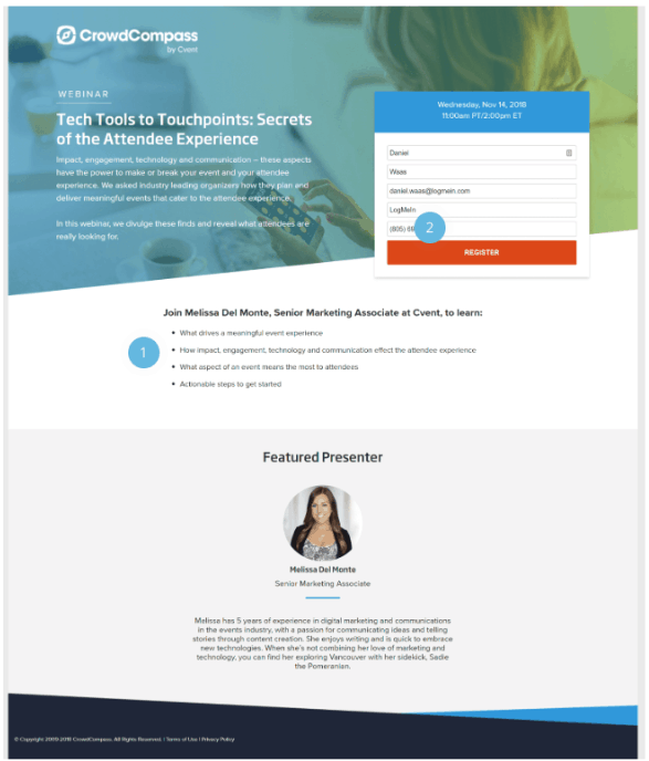
The register button stands out and users don’t have to provide too much information to get started.
What could be better?
The title feels a bit clunky. Something like “X Secrets for a Meaningful Attendee Experience” stands to get users more excited about the webinar.
There’s no real need to include a phone number on the form—and at worst, it may decrease the conversion rate. We get that this is a lead gen effort, but you might include a chatbot on the page to answer any questions or poll people in the session to ask if they’d like to have a follow-up conversation.
Using the word “Register” isn’t necessarily a mistake, but it’s not very exciting, either. In this case, something like “save my spot” or even the slightly more urgent-sounding, “register now” could be more effective. It might also be worth adding a second call-to-action further down the page to drive the point home a bit more.
Include Video Content
This example from Kickoff Labs uses a video to give users a clear picture of what they can expect to gain from the webinar.
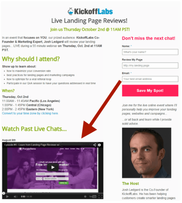
The reason this works so well is users don’t like to waste time. Adding a video from a past session can help potential registrants get a sense of whether this event provides anything of value.
Consider using video marketing to show off your speaker’s skills and overcome any pre-registration objectives. That said, this example does a nice job of outlining key details for those who don’t feel like watching.
What Could be Better?
Well, the page is a little busy and the layout isn’t the best. While they’ve done a good job coordinating the colors and breaking the text into digestible pieces, the sizes of the video player and the speaker’s headshot seem out of balance.
Outline Webinar Objectives
In this example from Unbounce, you’ll notice they do a nice job highlighting what you’ll learn from watching the session.
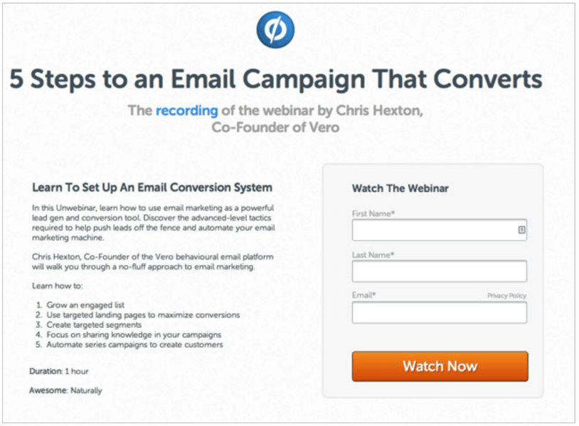
It’s super short, but by reading the bullet points, you know that’s there’s a plan—you’ll move from growing an engaged email list to creating an automated email series. We also liked they’ve included a duration so users can play the recording when they have time.
What could be better?
Though the simplicity is generally a positive thing, it would be nice to see photos or graphics on the page to generate some more interest. Even just creating a contrasting header and adding a headshot of the speaker could go a long way in generating visual interest.
Finally, the short form is attractive to registrants who don’t know how much money their business brings in or the number of employees but it doesn’t provide marketing teams with any information about new leads. Even the addition of a company name or the website could help bring more context to the table.
Collect Qualified Leads
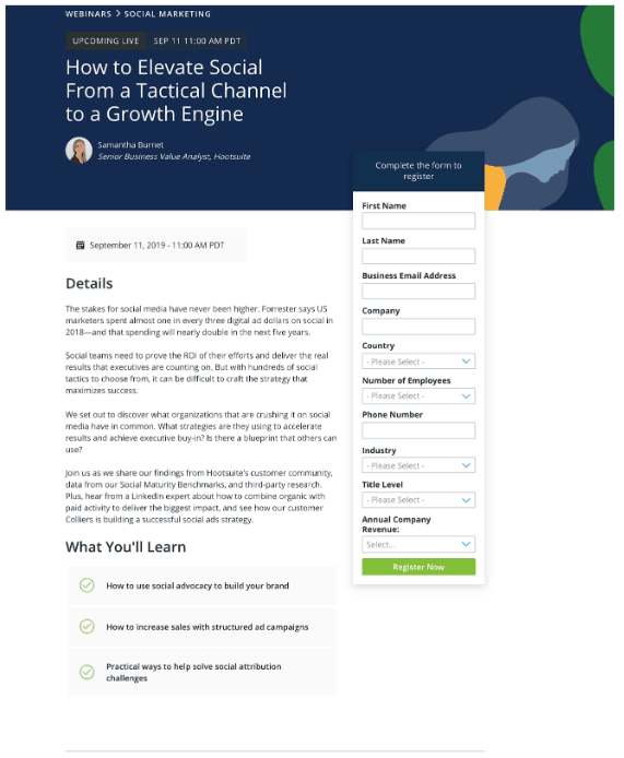
HootSuite’s landing page is well-designed—the blue and green color scheme, graphics and the form that follows you as you scroll come together to create a cohesive on-page experience. While one might argue that the form is a bit long, the advantage is that those people that do sign up using it provide more context for marketing and sales to deliver personalized content later.
What Could be Better?
The bios are a little long and take up too much space, and to make matters worse, all are varying lengths, which looks bad from a design perspective. We’d recommend keeping the headshots but including names and titles only.
Additionally, Hootsuite has included the full navigation bar along the top of the page, which presents a few too many opportunities for users to click away from the landing page without completing the registration.
Highlight a Desirable Outcome
Upwork does a nice job here communicating a benefit by getting specific. Notice how they say how to get 100k subscribers instead of just saying “more subscribers.”
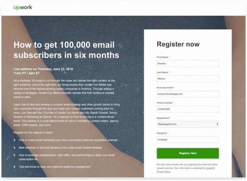
We like that the green CTA button captures the visitor’s attention by jumping off of that white form, and the bullet points showcase the benefits of the webinar.
Additionally, the second paragraph highlights the authority of the speakers, which suggests that they might know a thing or two about growing an email list.
What Could Be Better?
In all, Upwork’s page looks pretty good. The registration box stands out and doesn’t go overboard with form fields. That said, there’s a lot of copy before you get down to the bullets. The title does most of the heavy lifting here, but the text isn’t super scannable.
We’re also not sure what the design has to do with the Upwork brand or email marketing, in general.
The white copy might be hard for some users to read; in this case, it seems like sticking with the standard black text on a white background would be a major usability upgrade.
Additionally, there’s no escaping the page. We’d add a clickable logo that takes the user back to the homepage, as well as social media buttons that allow visitors to share the webinar with their network.
Play into that Sense of FOMO
Groove kicks things off here by creating intrigue with the headline, “paid search is evolving,” then using a question in the subheadline to engage the visitor. Using language like “don’t miss it” or “you can’t afford to miss this one” speaks to our inherent fear of missing out on something valuable.
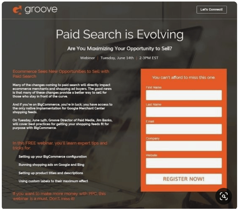
They’ve also done a nice job keeping the form pretty short, but asking for a website and company name that can help sales and marketing tailor future messaging to some extent.
Additionally, the short paragraphs do a nice job explaining what this webinar is about, while the bullet points reinforce the benefits associated with signing up.
What Could Be Better?
For starters, the CTA just blends in with the form, the button should stand out, showing that it’s different than the surrounding elements.
Additionally, all of the copy is treated the same. Text is bolded, while the headers almost look transparent against the gray-colored background. While they’ve done a decent job with the layout, the fact that they treat headlines the same as the body text makes it harder to read what’s on the page. Just think of how much more powerful this would be if those headers stood out more.
Finally, Groove’s Let’s Connect link doesn’t need to be there—it guides prospects off the page. And when combined with the hyperlinked logo, it’s too easy for the visitor to leave without signing up.
Highlight a Pain Point
Search Engine Journal’s webinar brings up a major problem for large enterprise websites—the Google algorithm is failing to index a good portion of their pages. This means that those sites are missing out on traffic conversion rate optimization wins.
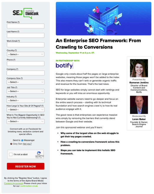
What’s great about this example is, they do a nice job bringing up a real problem, but also promising to help their audience solve it. The description is pretty detailed, but they don’t give away all of their secrets.
Design-wise, there’s a lot going for this page, as well. There’s plenty of white space, a prominent logo, and a can’t miss register now CTA done up in red. The speakers are featured prominently with just enough information to show credibility, but without forcing complete bios on the reader.
What could be improved?
The landing page copy does include bullet points, but they’re a few paragraphs down the page. This means that you’ll need to read the copy to find the unique value proposition. Additionally, the form is a bit long. While collecting more information can help sales reps personalize content, some users might be put off by having to answer a bunch of questions before they can register for the session.
The Captcha right before the CTA button isn’t a huge deal, but it’s one more thing that might annoy registrants at that moment before the signup. And finally, while we appreciate a link to the home page, this one is a bit small. It might be better to have a clickable logo that takes the reader back to the main site.
Which Webinar Landing Page Inspired You?
One thing all of these webinar landing pages have in common is that they stay focused on a single CTA and keep copy to a minimum. As you design registration-focused landing pages of your own, make sure that the benefit is clear–what can people learn from logging in? What do they lose by skipping out on the session?
Want to learn more about landing page software that start conversations? Schedule a free landing page consultation here.
Level Up with Sales & Marketing Webinars from Drift
Watch live and on-demand webinars from leading sales and marketing professionals now.