Often, the signup page represents the final phase in a brand’s demand generation funnel. The prospect has evaluated the offer, compared it against the competition, and has decided that your company is the best brand for the job.
It’s important to note, however, that signup pages aren’t all the same. Some exist purely to build out an email list, while others collect event registrations, promote a free trial, or feature a lead magnet.
But here’s the thing about all signup pages, they usually include a form. Forms are hard to get right, and have long been the subject of countless marketing blogs over the past decade.
We’ll go over some best practices that help brands design signup pages that convert, forms and all.
1. Only Ask for the Information You Need
Many marketers ask for way too much information on their landing page forms. We understand the impulse, as forms are an opportunity to collect data about the people most interested in your product or service. Still, in most cases, short forms are better for conversions.
Birdeye’s signup only requires customers to fill out a few fields to get started with the free trial account, but adds in a Drift-favorite strategy to collect additional visitor data—chat.
If you scroll further down the page, you’ll find company logos and customer reviews, which add credibility by proving the claims up top are, in fact, the real deal.
2. Make Mandatory Fields and Errors as Pain-free as Possible
Things like a single-column design and autofill go a long way when it comes to reducing form friction. But, it’s also worth pointing out that how you address errors and entry-formatting is just as important.
Make sure you communicate exactly how users can fix incorrect information by highlighting the sections that need attention, much like Classpass has done here:

There’s nothing worse than a website that keeps telling you to correct the errors, but doesn’t make it easy to make those changes.
If a user fills the form incorrectly and you need to show an error message, make sure the fields keep the data that they’ve already provided so they don’t need to fill out the entire thing from scratch. This will likely cause users to give up out of frustration and skip out on your great offer altogether.
Additionally, you’ll want to make sure that you aren’t too picky about how users submit their information. It’s one thing to call attention to invalid email addresses or credit card numbers, and another to worry about data that can be represented in more than one way.
For example, if you’re asking for dates, you might accept both 2019 and 19 as valid or allow users to decide whether they’d like to separate numbers with a dot OR a dash. Or, if you need a phone number, don’t get too hung up on whether they use spaces, dashes, or brackets.
3. Allow Social Sign-ups
Social sign-ups save time and reduce friction by allowing your users to easily get started with your product/service/subscription with an existing account like Facebook or Google.
This feature is appealing to users as it one, eliminates the need to remember yet another password, and two, it allows you to funnel some of Google/Facebook’s credibility to your own offering, as users automatically assume social sign-ups are more secure.

4. Design with Action in Mind
Landing page visitors need to be told what to do next, otherwise they might not take you up on your offer. Be sure to include action-oriented copy that highlights the benefits your solution provides and reinforce them with CTA buttons that indicate exactly how to reap said benefits. This article from Venture Harbour suggests using CTAs that complete the statement, “I want to…”
See how it works in this example from The Listings Lab; “I want to… get my free PDF.”

You’ll also want to be sure that you’re crystal clear on what happens after someone completes the signup form. Whether they’ll be receiving a weekly newsletter, a case study, or kicking off a free trial, users should know when they’ll hear from you and what to expect.
To do this, you might use a “Thank you” page or an inline message that pops up after submission. However, you’ll want to be strategic about where to send them—it might mean prompting them to check an email to activate their account or encouraging them to look at a piece of content—whatever the case, be sure that the post-signup action aligns with your goals.
To make sure that your sign-up landing page inspires action, ask for feedback. Have a few outside sources look at the page for about 10 seconds and ask them to tell you what they’re supposed to do next—if it’s not 100% clear, your copy isn’t action-oriented enough.
5. Use Directional Visual Cues
While there’s some debate as to how much visual cues really impact conversion rates, it’s worth pointing out that visual cues like contrast, lines, arrows, and even white space serve as a way to move users through your form.
Here’s a heatmap from a ConversionXL study that shows how specific patterns impact the user’s gaze:

6. Personalize the Offer
This example from Airbnb builds in a personal element, by allowing users to enter their location to estimate how much they might earn by becoming a host. You can enter additional information about your potential accommodations into the fields to get an even more customized estimation.
7. Highlight Specific Benefits
It doesn’t matter if you’re making the case for a free trial or trying to convince someone to sign up for your awesome webinar, you need to make the value of signing up very clear by highlighting the specific benefits associated with the offer.
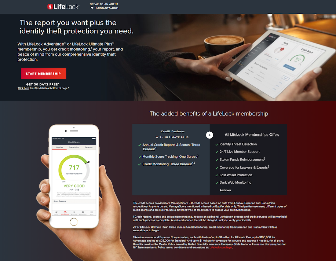
In this example from Lifelock, they’ve laid out exactly what you get when you sign up–credit monitoring, a comprehensive report, etc. What’s nice about this signup page is, it shows the software in action, so potential users can get a sense of how it looks on their phone or tablet.
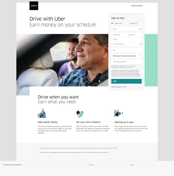
For another approach, look toward Uber. The ride share company digs into a specific pain point that speak to potential drivers—the ability to earn money on your own time. The headline clearly communicates that benefit up top, while the three graphics below provide a few more details for those that need a bit more convincing.
8. Clarify Complex Concepts
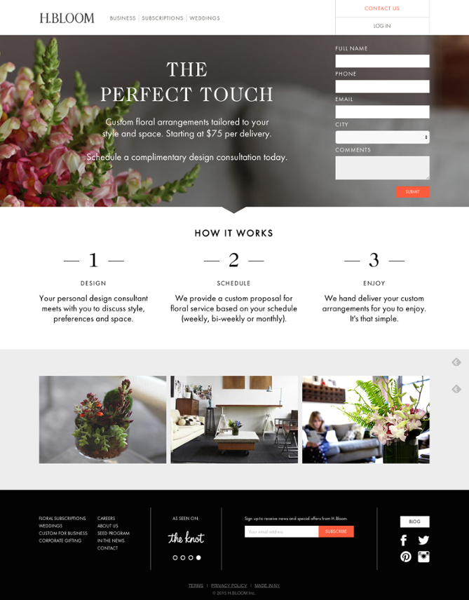
This signup page from H Bloom is more than a form and a couple of benefits. Instead, the company reinforces its offer in three different ways.
Below the headline, you’ll get a brief explainer–custom flower arrangements designed for your style and space. Next, you’ll get a three-step breakdown of how it works, followed by images that show the product in action.
Wrapping Up
Signup pages are essential for generating leads, driving conversions, and growing your subscriber list. Still, it’s not always easy to get them right every time.
The Modern Marketer’s Playbook
The marketing landscape is changing fast. Get ahead of the game.