People don’t just stumble upon your app by showing up in the app store and scrolling through hundreds of options. While it might happen now and again, discovery isn’t something you can hedge your bets on.
As such, app downloads rely on driving the right traffic to a dedicated landing page and convincing visitors to take a chance and download.
App landing pages are pretty much just like any other type of landing page, they’re designed to get users to take action and must make the case for your offer through a combination of carefully-chosen words, images, and design elements.
Focus on the Mobile Experience
Given that apps typically designed to be used on mobile devices, we recommend designing for mobile first, rather than approaching this as a mobile-responsive desktop page. This approach will help you set the stage for visitors most likely to download your app.
While the general rule of thumb for all landing pages is to stay focused on the offer, mobile pages tend to do best when they really take the 1:1 attention ratio to heart.
Speed, too, is a major factor for mobile. Which means that while you’ll need to include enough information to make sure your audience understands what your app is all about, unnecessary page elements can slow download times.
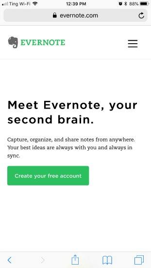
In this example from Evernote, they’ve gone completely minimal. You have a headline, description, and a CTA—and that’s it. While the page might benefit from additional imagery, the white space combined with the bold headline and green button is incredibly eye-catching.
Plus, users can scroll below the fold for more context.
Design your mobile app with your ‘tap targets’ (aka, links, buttons, and other interactive elements) in mind. You’ll want to make sure clickable elements are large enough to accommodate big, clumsy thumbs, much like Hearth has done here with its CTA buttons:

This example also serves as a reminder that mobile devices don’t really need multiple columns, so landing pages work best when they stick with the single-column format. That simplicity allows for a better navigation experience and prevents the screen from feeling overly crowded.
Show Users How it Works
Here’s an example from Cameo, an app that allows users to shop for personalized messages from influencers and celebrities you can send to friends and family, like a video greeting card. While the app isn’t especially complex, if you’ve never heard of it, you might not immediately have a sense of how it works.

Here, they’ve done a few things to explain the offering without getting overly wordy.
- The headline, “Famous faces on demand” cuts straight to the value proposition.
- They show users how to book a Cameo in three steps—see, it’s easy.
- Then, in the next section, they’ll go over some specific ways you might Cameo, with a short explainer from Shark
- Tank’s Kevin O’Leary and some supportive bullet points.
Another example comes from Gem, a news app with a twist. The app aims to offer users an alternative to the algorithmic feeds that control the information we see on social media and other aggregate news apps.
In this case, Gem needs to make the case as to why users should use their solution as opposed to Facebook or Apple News.
Here’s how they explain the core benefits without overloading visitors with too much information.
- Headline and subheadline present the value prop right away. This particular headline, “your oasis from mindless feeds” speaks to a specific type of person. Someone who wants to be seen as smart and informed–with control over the content they consume.
- The next section gives us a little background story–with a dash of fear-mongering thrown in for good measure. Gem aims to address the Orwellian fear that one day, the information would be concealed from the masses instead, recommending articles based on what you decide is relevant.
- Benefits are broken into three sections. Gem goes on to explain how the app works, Users can adjust the number of influence factors that determine recommendations, and further down the page, underscores the brand’s values–they don’t make money from running ads and their goal is to create a thoughtful community.
IFFT, the popular productivity app that connects multiple tools, is another offering that may be hard to explain to new audiences.
To combat this issue, the brand offers up a few different scenarios for how you might use the app.
Keep Copy Focused on the Benefits
Your app landing page copy should anticipate and answer the reader’s questions and satisfy what they were hoping to find when they clicked in the first place.
While the length of your copy will vary based on your industry and the type of app you’re trying to promote, the goal is to keep things as short and as focused as possible. Different views of what the app looks like on an actual phone, combined with the high-contrast color scheme and short benefit-oriented copy make really effective app landing pages.
Show the Device
Graphics are great and all, but it’s frustrating when you want to learn more about an app or software program and there aren’t any clear pictures of what it looks like in action.

This Starmatic landing page is relatively simple. While we’re not wild about the use of white text on top of a busy background, they do a nice job placing the actual app front and center–making it look as though it’s the viewer who is taking the picture.
While an iPhone photo app might not need as much explanation as say, Gem or Cameo, this approach allows marketers to communicate what they’re selling without going overboard with the copy.
Highlight Reviews, Testimonials, & Press Mentions
Whether you decide to leverage glowing customer testimonials, press mentions, or use reviews in your app landing page, social proof quickly communicates to users that your app is trustworthy.
Prisma’s app landing page works well on so many levels. There’s a ton of white space, download buttons are placed above the fold, and the combination of images and copy immediately makes it clear what you can do with this app.
Beyond those elements, they’ve really nailed it on the social proof front. With press mentions from top outlets further down the page, visitors can read the great things sites like the New York Times, Tech Crunch, and others have to say about the app.
Wrapping Up
Whether you’re promoting the promise of productivity or a new game that does the exact opposite, app landing pages demand more focus than their desktop counterparts.
Make sure your website is optimized and ready for conversions by booking a free assessment with a Drift conversion expert. During our 30-minute call, we’ll discuss actionable ways to drive more app downloads and other conversions.
B2B Buying Secrets
We asked 20 marketing and sales leaders at large technology companies a simple question: how do you buy?