
The key difference between your homepage and your post-click landing pages is purpose.
Your homepage is designed for everyone and places the responsibility for navigating through the site on the visitor. A successful homepage should compel your visitors to check out another page and identify the information they need themselves. By contrast, a landing page provides users with tailored information that matches their needs upon arrival.
Homepage traffic comes from a wide range of sources and should contain general information about what your company does, with a rundown of the products and services you provide.
Success depends on several things–ranging from making a purchase to reading blog posts, chatting with a bot, or filling out a form. Landing page traffic often comes from an outside source such as a paid ad, email, or organic social post. This gives marketers the ability to target different segments with offers specific to that audience and makes it easier to track campaign performance.
In this article, we’ll go over some key differences between homepage and website landing page best practices, as well as what the two have in common. Let’s take a look:
A Website Landing Page Focuses On One Offer
As mentioned, a homepage is all about inclusivity, speaking to the broadest possible audience and promoting multiple offers and places to go. By contrast, a post-click landing page is highly specific, aiming to focus on one offer at a time.
Here’s an example from Tidal’s streaming service. You’ll notice that there’s a single path for users; to become a member.
If you’d like to move in the complete opposite direction, this landing page from LinkedIn represents a different kind of focus–detailed information about a specific offer. Because they’re introducing a new offer, in this case, the chance to participate in a pilot program, they have to provide much more information to visitors than the Tidal example.
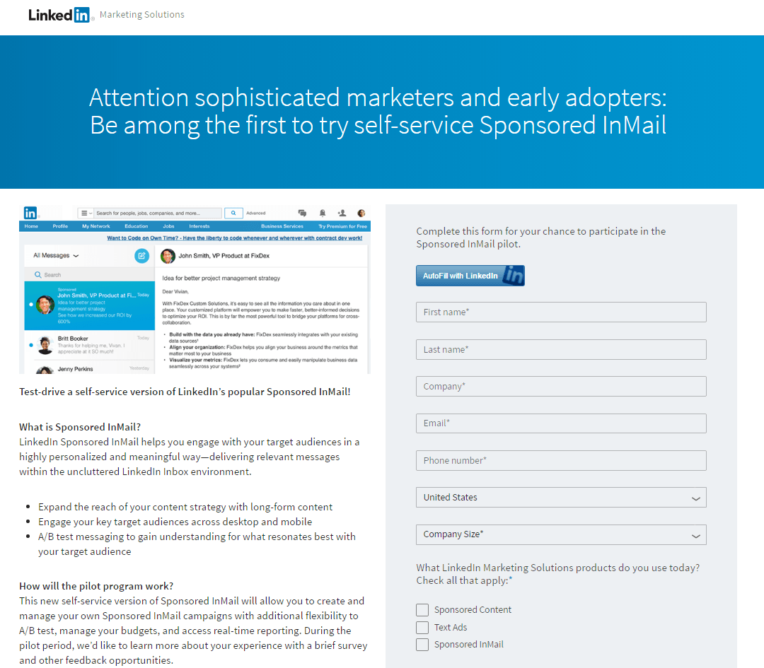
How does Sponsored InMail work? How might users benefit from adding this to their LinkedIn marketing strategy?
While LinkedIn’s example is miles away from what Tidal is trying to accomplish, the key thing to consider is the audience. Tidal’s offer is designed for the B2C crowd and is a streaming service, something familiar to most people who use the internet. LinkedIn Sponsored InMail, by contrast, is for marketers and early adopters, and as such, aims to capture a narrower niche market.
Landing Pages Should Ditch The Navigation
Though there are certainly some exceptions to the rule, a navigation bar is essentially an invitation to leave the page. Building on the last point on keeping offers focused, you’ll want to make sure that your readers don’t get distracted by all of the potential links they can click.
When you design a landing page, the first thing you should ask yourself is what is the goal of the person who lands there? You want them to take action. You’ve already designed an offer for a specific group and post-click, there’s only one thing left to do.
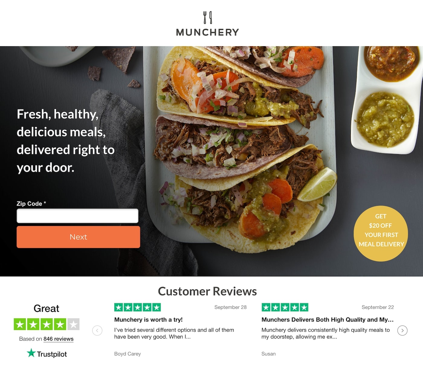
In this example from Munchery, the CTA aims to get people to place their first order, not read the “About us” section on the company’s website or browse the selection of meals. They can do that afterward.
On your homepage, it’s impossible to align with every visitor’s set of goals. New prospects are going to want more information about what your company does. They might read the origin story behind your business and read a couple of blog posts, but probably won’t purchase right away. Those who have already done some research might go straight to the page featuring plans and pricing to narrow down their options.
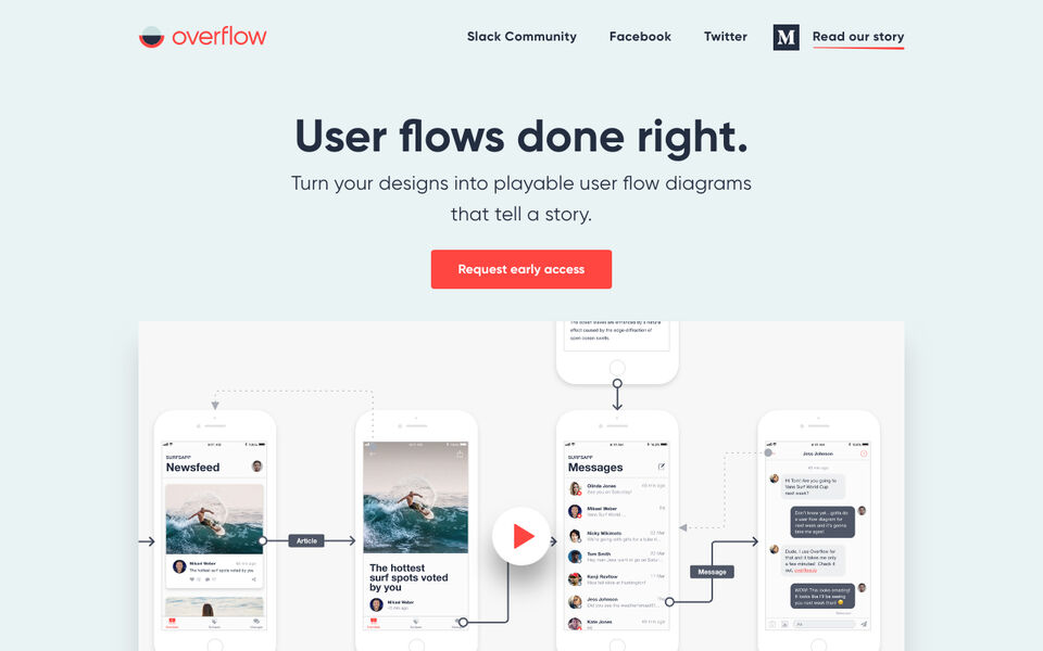
If you look at this homepage example from Overflow, you’ll see a similar design as a lot of successful landing pages. It’s clean, the CTA buttons stand out, and visitors are encouraged to sign up. That said, not every visitor is ready to take the plunge. And for that reason, the site features a link to a product tour, company story, and even includes a video, front and center.
Have A Tight Connection Between the Landing Page & The Ad
If you write a PPC ad promoting women’s jackets, but the landing page contains back-to-school clothes for kids, you can’t expect to convert incoming traffic. When you direct users to your homepage instead of a landing page that matches your ad, you’ll deal with a similar issue–confusion.
We recommend writing your ad copy and the corresponding landing page at the same time. This way, it’ll be easier to ensure that there’s a match between the two. Tone, offer, and value proposition must align toward the same goal.
In the below example you’ll notice how both the ad and the landing page offer the promise of better email marketing–to the point that they use those words in both sets of copy. For website owners, that relationship means that people who clicked because they were interested in the ad will likely be interested in your offer when they arrive on-site.
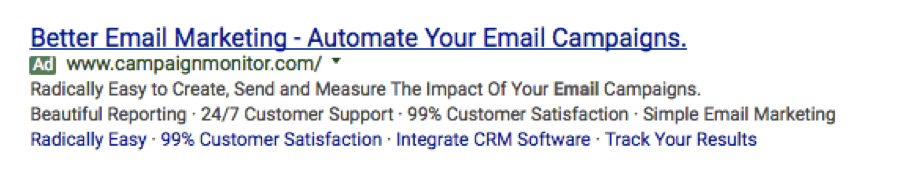
Notice how the landing page title tag includes the keyword that the ad was optimized for.

Follow Principles of Visual Hierarchy
Though it’s important to understand that there’s a core difference between what a landing page should do versus what a homepage should do, both should follow a basic visual hierarchy.
According to research, people tend to prefer webpages that follow familiar layouts. This is why you’ll notice that many websites are set up so that key elements match up with the “Z” and “F” patterns that represent how our eyes move through websites.
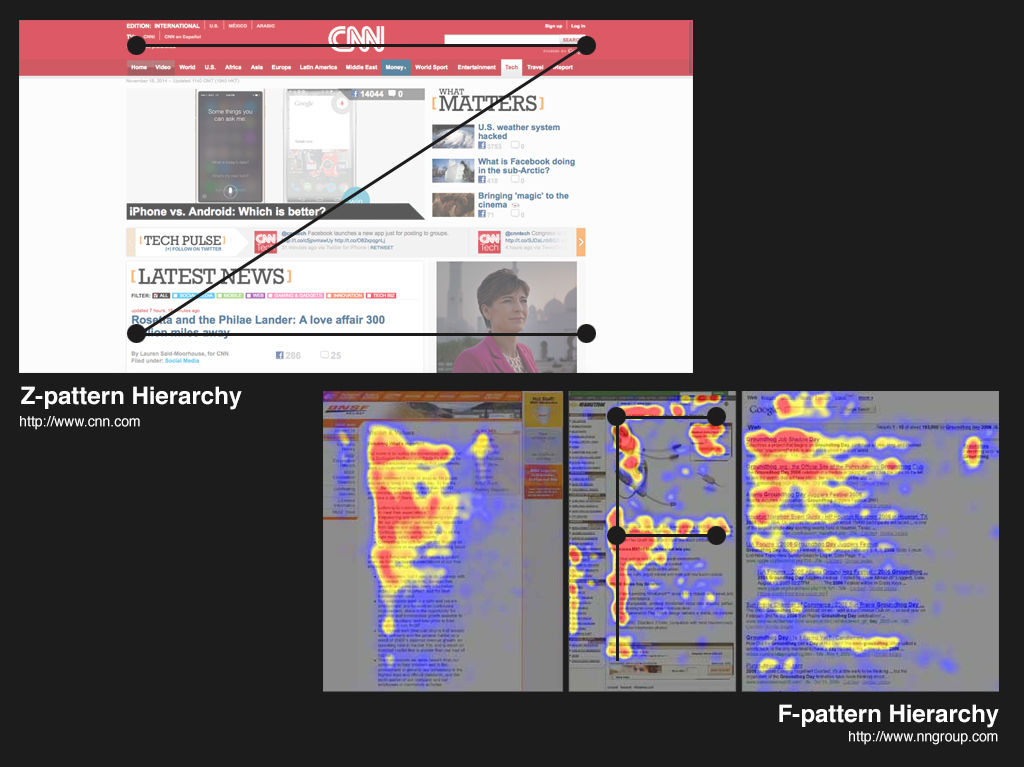
The report also discusses a concept known as the “aesthetics of reading” noting a preference for simple, easy-to-read fonts, bullet points, white space, and appealing imagery.
Here’s a landing page that offers a good example of what visual hierarchy should look like:

This example follows the “Z” formation and brings in plenty of blank space to keep readers focused on the headline and benefits on the page.
Wrapping Up
In the end, it’s important to remember that you shouldn’t be sending paid traffic to your home page—ever. Landing pages are designed to convert, whereas homepages are general, broad, and comparatively unfocused.
That said, a great website landing page and a great homepage aren’t so different in the end. While landing pages home in on a specific segment and homepages are designed for the masses, both should align with the brand’s message, values, and imagery.