The App Store is a crowded place with an estimated 2M apps currently available for download. As you may imagine, brands compete hard for visibility in the online marketplace. Those that fail to lock down a spot on the platform’s top lists face some challenges when it comes to getting in front of their audience.
With that in mind, brands need to take matters into their own hands to drive downloads and rise through the ranks in the App Store. A big part of that plan? iPhone landing pages.
In this article, we’ll look at some examples and best practices for designing iOS landing pages that convert.
What to Know About Designing iPhone App Landing Pages
When it comes to mobile—iOs and Android—you don’t have a whole lot of space to make the case for your app. It is critical to separate the mobile and desktop experiences and understand how users’ behavior varies between the two in order to optimize for conversions.
A few basics:
- Organize Toward Action. Rather than forcing your visitors to pinch and scroll for several minutes, place your call-to-action at the top of the page to make things easy.
- Use High-Contrast. In mobile design, high-contrast is huge. You want a clear contrast between the text and images and the background so that all key elements “pop” off the page and drive action. High-contrast also makes your landing page more visible for users browsing in natural outdoor light.
- Keep Copy Short and Sweet. Headlines and copy should be as short as possible. Headlines should be about four words while landing page copy should stick to the essentials only. Once you’ve written your landing page, cut every word that doesn’t absolutely need to be there. You’re working with limited real estate, and just one extra word can make your page feel cluttered.
- Don’t Over Do it with the Visuals. Visuals are an essential piece of the conversion puzzle, but they can also be quite demanding on servers and mobile Internet connections. You want your iPhone landing pages to load quickly, so users don’t leave in frustration.
- Size Matters. CTA buttons should be big enough to accommodate thumbs, while text and navigational links should be easy to read without squinting or zooming in. One way to get around small text is to design your iPhone app landing pages for mobile, rather than a mobile responsive solution. Because the goal is to drive mobile downloads, optimizing for iPhone users can go a long way in reducing friction.
In these next few sections, we’ll go over some specific examples brands use to promote their own iPhone apps.
Get Right Down to Benefits
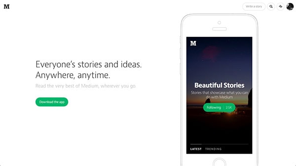
Medium’s online blogging platform allows anyone to share their ideas whether they’re pro content creators or passionate amateurs. What’s nice about this landing page is, it cuts right to the core of Medium’s value prop, bringing a variety of stories to readers on the go.

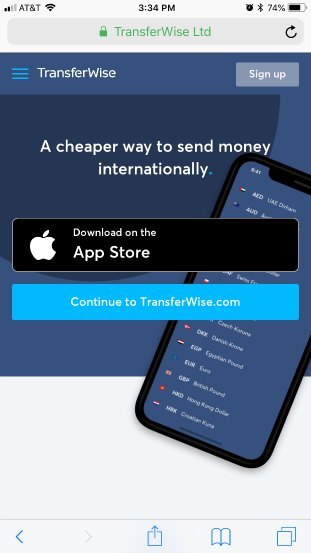
Another example from Transferwise leads with a simple headline and a CTA. Want a cheaper way to send money internationally? Well, all you need to do is download the iPhone app to get started.
With a benefit-driven headline and ample negative space, there’s no way visitors will miss that call-to-action.
That said, for those that need a bit more convincing before downloading the app, they’ll have the option to scroll for the specifics.

Make Your Purpose Clear
Any mobile landing page should immediately be clear on how the user can drive action, using a combination of placement, contrast, and compelling graphics to highlight the desired action. Clarity also hinges on limiting the number of options available.
For example, adding links to social profiles, links to other pages, or a menu brings more variables into the mix–and decreases the chances the user will make the choice that you want them to make.
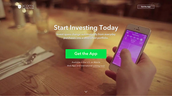
In this example below, you can see that the easy investing app, Acorns places the “action” front and center. The one-line description tells you exactly what this app does–invests your spare change–and invites users to take action right then and there. Viewers immediately get the sense that it’s easy to get started and can sign up with the click of a (very bright) button.
What’s nice about this particular example is, the colors of the CTA button and the app reinforce the brand’s approachable take on investing, without adding any extra words to the mix.

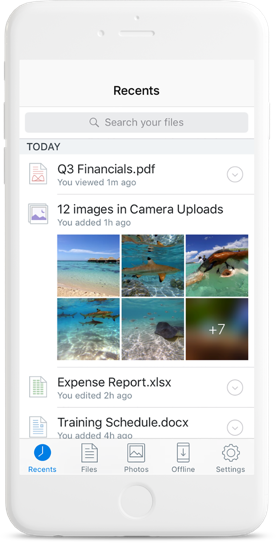
Dropbox Business follows a different approach in this example below. The use of white space coupled with an in-app view of all of the different file types a real user might upload to their Dropbox account allows the brand to go light on the copy and stick to the essentials.
The blue CTA button stands out against the stark white background, and the combination of the subheadline and device image immediately give users a clear picture of what to expect from this app. We also liked how the brand includes the option to receive the link by text or email, removing the step of switching devices and searching for the app for desktop users.

This example from Human uses large images that show users how the app might look on their actual device. The in-app views (featured throughout the landing page) help bring more context to an app that may seem a bit confusing to someone who has never heard of the solution.
When in Doubt, Choose Clarity Over Minimalism
While many of the examples we’ve outlined above get the job done with little copy and a lot of white space, some iPhone landing pages benefit from including a bit more information. An empty page without context won’t set you up for conversions.
Every landing page should answer the following questions:
- What does this app do?
- How does this help me?
- Do other people like it?
- Can I trust this brand?
- How do I get it?
- How much does it cost?
Making your copy crystal clear by adding a couple of extra words goes much further in boosting conversions than simply removing navigation links. After all, no matter how much you limit the number of choices your visitors can make, they still have the option of closing the browser window and checking out a competitor.
This landing page from Zoho offers a longer headline and subheadline than some of the other examples we’ve included on this list. As you scroll, you’ll also learn more about the app and everything it does.

Keep in mind, this “longer” landing page works because the top of the page is still optimized for mobile conversions. You have your CTAs placed above the fold, on-page elements contrast with the background, and Zoho immediately highlights the value proposition.
Wrapping Up
Just like any landing page, iPhone landing pages work best when the user experience comes first and the language stays focused on persuading visitors to take a chance on the download.
The recommendations outlined above should help you fine-tune your iOS landing page strategy.
For more specific ways to boost conversions, you can sign up for a 30-minute conversion assessment with one of Drift’s marketing experts. Book a call here to set it all up.
B2B Buying Secrets
We asked 20 marketing and sales leaders at large technology companies a simple question: how do you buy?