After all these years, 50% of customers still say email is their preferred communication channel for connecting with brands, making the inbox the perfect place to drive conversions.
While email marketing has been a part of the digital conversation for decades, email landing pages don’t get as much play on marketing blogs and white papers as the email itself.
But great emails alone don’t make a campaign. To drive conversions from those emails, you’ll need to push your audience in the right direction so that they complete the desired action–be it a purchase, webinar registration, download, or something else.
That means that where your customers land after the click matters as much as the message itself. As such, each email should come with its own landing page, one that is tailored specifically to the segment receiving the email.
So, what makes for a great email landing page? Well, in many ways, the same factors that make any landing page work–a strong CTA, enticing offer, a compelling headline, etc. But, there are a few differences in the mix, as well.
Read on, and we’ll look at the key ingredients for success.
Why Email Landing Pages Are a Critical Piece of Your Marketing Strategy
Email is one of the best ways to get people to visit your landing pages, but the email itself is only half of the strategy. Email marketing campaigns must have targeted, optimized landing pages to take the visitor from the click-through to the conversion.
With email landing pages, you’re also speaking to people who have already provided some information about themselves. These people already know your brand and have opted into receiving emails.
As such, you might use this strategy for any of the following goals:
- Lead nurturing: Target subscribers by promoting offers that speak to specific interests, behaviors and pain points. You might try offering exclusive discounts, custom content, or use this as an opportunity to drive them toward signing up for an event or a free trial.
- Engage existing customers: Segment your list through based on how visitors behave on your website and identify and find your most frequent users. Send them a link to open a page with special discounts or free giveaways to reward their loyalty.
- Collect Feedback: After someone makes a purchase your work isn’t done. Use email campaigns to deliver surveys or ask users to leave a review.
Add the FOMO Factor to Your Email Landing Page
People hate missing out, it’s just one of those universal truths. Whether that’s a great deal or a one-time opportunity, if something won’t be around forever, subscribers feel compelled to act fast. Here are a few ways you can tap into FOMO to drive conversions:
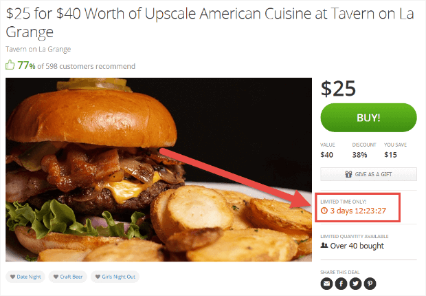
Groupon approaches FOMO with a limited time offer, you’ll miss out on the deal if you don’t act soon.
Starbucks offers a slightly different approach, instead choosing to highlight everything you’ll get when you become a loyalty member. Non-members miss out on perks like free drinks, the ability to order ahead, and of course, birthday rewards.

Or, you might make like Airbnb and create a sense of urgency. This is an effective tactic as your subscribers definitely won’t want to pay more for something they’re thinking about purchasing.

Use User-Generated Content
Using user-generated content (UGC) lets visitors and potential customers can help you drive conversions by both showing your products/service in action, while also delivering a dash of social proof to build credibility. What’s more, data from Yopto found that 77% of customers prefer user-generated photos, as they help communicate value to prospective buyers.
Try pulling content from your Instagram feed, review sites, and other UGC channels and adding them to your email, landing page, or both. Here’s how Fabletics incorporated users’ Instagram posts into a
![]()
Keep A Tight Focus on the Offer
When someone clicks on a link in an email and are taken to a landing page, that person is focused on completing one task, which increases the chance that they’ll go the distance and complete the action.
By contrast, consider what might happen if a subscriber clicks a link and lands on the home page. In this situation, they’ll need to figure out their next move themselves. If you’re lucky, that person might browse through your website and convert on their own, but even in that best-case-scenario, your efforts are hard to track. Worst case, the visitor is confused and clicks away.
An effective landing page cuts through the noise, eliminating the extraneous links, images, comments, and irrelevant offers so that the subscriber can evaluate this one thing. Keep things focused by creating a landing page that echoes exactly what was outlined in the email.
A Matching Look and Feel
The email and landing page should be closely connected. If that’s not the case, the subscriber might get confused, or worse, assume that you’re trying to scam them. Avoid that disconnect by syncing your landing page, and email, like Moo has done in this example below (FYI: the email is on top):

This means you should maintain the same font, imagery, language, logo, and design in both the inbox and post-click landing page.
Again, when subscribers click on an email’s CTA and they see a matching landing page, they know they’re in the right place. If you do mention an offer in your email campaign, make sure you repeat it on your landing page, as well.
In the Moo example, they’ve done a nice job reiterating that 15% off in both pieces of content. You’ll notice that while the copy isn’t exactly the same, both pieces mention the discount code and the Luxe collection they’re promoting–no confusion there.
Avoid Escape Links
If we’re talking home page design, then options are considered a good thing, as they offer visitors an opportunity to explore content, products, and a whole range of offers.
In that case, navigation can help lower bounce rates and help visitors understand the product and the brand. Landing pages, however, serve a different purpose. Here, your goal is to get your visitors to follow clear instructions, like sign up for a free trial or make a purchase. Or, in this example from Grammarly, the aim is to get visitors to add their extension to Chrome.

Graphics Matter
According to research from Xerox, subscribers are 80% more likely to read content if it includes eye-catching colors and high-quality imagery. This means you’ll want to put together a email-landing page combo that gets subscriber attention.
Add images and graphics, dynamic sales text, and more to convince your subscribers to head to that second location. Keep in mind, stock photos won’t do much when it comes to helping brands build trust or build a relationship with their audience.
As mentioned above, graphics need to match up with your campaign and should be consistent across both the landing page and the email that gets visitors to that destination.
Once there, consider adding a video that offers more information post-click. Because email service providers block images and don’t usually support embedded video, the landing page presents an opportunity to deliver the multimedia “wow factor” that email can’t provide. Entice your audience with compelling copy and a static image, then expand on that experience after the click.
Wrapping up
Email campaigns and landing pages are the perfect pair for driving conversions, but you’ll want to make sure that both elements work together to reinforce the visitor’s decision to take action.
- Why should they sign up for a free trial?
- Why should they buy that winter coat or join your rewards program?
- What will they gain by taking this leap?
Keep the focus on how you add value to your subscribers by using testimonials, videos, and more, and be sure to test out different colors, fonts, headlines, and CTAs, to see what really drives conversions.
The Ultimate Guide to Email Marketing
Everything you need to know to increase email engagement and start conversations NOW.