An e-book is a great way to position yourself as a thought leader, a resource, or authority in your field.
But, just because it’s free doesn’t mean that visitors will hand over their information, no questions asked. After all, the last time they did this, they received non-stop emails for information they could find elsewhere in a matter of clicks.
With that in mind, marketers need to approach the e-book landing page with a few things in mind. How will this resource help someone grasp a new concept or decide whether it’s finally time to sign up for that CRM or marketing automation software? How does what your company has to offer stand out amongst the crowd?
Here, we’ll look at some examples of e-book landing pages that make us want to learn more. Let’s dive in.
What Should an E-Book Landing Page Accomplish?
An e-book landing page is a bit different than your standard lead capture landing page. In a lot of ways, they’re pretty similar—for example, the goal is to capture contact information for later marketing efforts.
However—there are a few unique components that you’ll need to include when you’re brainstorming ways to promote your super long-form content:
- Describe Benefits First – What will you teach your readers? Do you have unique research or case studies to share? Expert insights? A step-by-step guide to doing something hard? If your landing page fails to convince prospects they need to read it, you won’t collect leads.
- Describe What’s Inside – Before readers swap their information out for this resource, you’ll need to make sure they understand what they’ll get.
- Eye-Catching E-Book Cover – Sure, e-books aren’t physical books, but adding some cover art lends a sense of legitimacy to your content.
As with any landing page, the headline, subheadline, and CTA are critical, as well. Ultimately, the goal is to provide enough information to readers so they can see if they’ll find something valuable inside.
Additionally, you’ll want to make sure that you present your offer in an aesthetically pleasing manner. This means, keep the copy to a minimum and make sure that it’s easy-to-read and uncluttered. Remember, it’s better to stick to the basics rather than trying to design too far out of the box, here. Your headline should be descriptive and speak to the benefits found inside the book.
Keep reading and we’ll show you some e-book landing pages designed to get downloads.
Nauto
Nauto, a data platform that aims to help self-driving cars become safer, has put together an e-book on the topic. The idea is to educate customers about this super specific product/service and how it works.
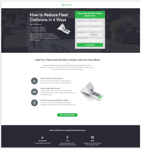
This e-book landing page doesn’t overwhelm users with a long contact form, and they’ve done a good job adding some credibility by incorporating statistics to prove they know what they’re talking about.
We also like the fact that they’ve used two CTAs—one near the top, and another at the bottom of the page.
What Could Be Better?
The copy is a bit small. While the headline is bold and clear, the white bullet points about how data can be used to improve fleet safety is a little hard to read.
Simply Measured
Here, you’ll find a landing page that focuses on one simple CTA. There’s no issue with competing offers and the blue and white color scheme is appealing as it conveys a sense of expertise, but doesn’t distract the viewer.

What’s more, they’re pretty clear about what the reader stands to gain from this e-book. They’ll learn to speed up the reporting process, use social listening to improve marketing campaigns, and present your ideas to internal stakeholders.
What Could Be Better?
Oh boy. The form fields. Right off the bat, you’ll immediately notice that there are an awful lot of fields standing between you and this e-book. While they’ve done a good job laying out the benefits of reading this resource, it’s worth pointing out that other websites provide this type of information without the third-degree. Our recommendation is to shave off a couple of these fields and stick with the basics—name, email, company. No need to ask for a phone number, department or function.
Mobify
Right away, Mobify kicks things off on the right foot, using a headline with a number to capture the reader’s attention. What’s more, the title is descriptive and lets people know exactly what they can expect to find inside the book after the download.
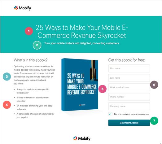
We like that the copy is relatively short and sweet. You’ll get a short paragraph followed by four benefit statements that give you a sense of what you’ll learn when you read the book.
What could be better?
Here at Drift we’ve run many tests and have found that adding a chatbot to a landing page increases conversion rate an average of 10-15%. That would give visitors to Mobify’s landing page a second option to convert.
Impact
IMPACT’s simple layout does a nice job eliminating any distractions that could undermine the offer. The headline copy “Generate Even More Leads from Your Blog” gets right to the chase, immediately letting readers know exactly which pain point this e-book will address.
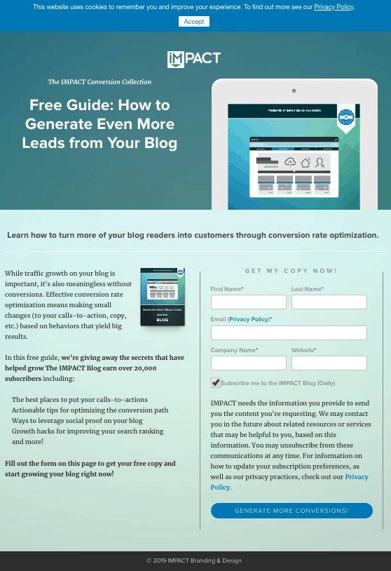
Everything from the colors to the outline surrounding the form to the fact that they’ve included a privacy policy signals that your email is in good hands.
Additionally, we like that the CTA focuses on the benefit—more conversions—rather than highlighting the fact that you’re downloading a guide.
What Could Be Better?
Overall, this is a real winner, but it would be nice to see some sub headlines in the main body, as it would break up the space and make it a bit easier to scan.
The text on the CTA button, too, could benefit from a bolder font, as while we like the phrasing, here, it’s not as eye-catching as it could be. And finally, while yes, we did just mention we liked that they’ve included a privacy policy, it’s really long. We’d recommend shaving off a few lines, as the length rivals the main copy and adds too much visual deadweight to the form.
Flywheel
Flywheel does a nice job here presenting a compelling offer—recurring revenue sounds great, right?
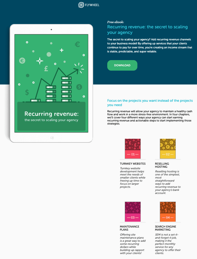
They’ve gone a different way here compared to some of the other exampkes we’ve included on this list. Though they’ve written more than your average landing page, the text is readable, broken into well-spaced short paragraphs with bold headlines that give you a breakdown of each chapter.
Additionally, the cover art follows you down the page and serves as a nice anchor to the content and graphics found on the right-hand side.
What Could Be Better?
While we’re not fans of a long form field, this one might be too short if the goal is to attract qualified leads. While readers might appreciate it, it’s potentially a missed opportunity to learn more about incoming visitors and why they’re interested in this resource.
Wrapping Up
Your landing page is the best place to present your e-book and the valuable insights that can be found inside. To maximize conversion rate, make sure you stay focused on one goal, that you highlight the benefits, and make the offer clear upon arrival.
The other thing you need to think about is making sure that your e-book is truly a valuable resource. See, if you disappoint too many people, word will get out that you can’t back up your claims.
Landing pages need a check up? Sign up for your free conversion assessment with Drift’s marketing experts. We’ll help you diagnose the problems standing between your e-book and its potential readers.