If you’re launching a product, building an application, or updating a few pages on your website, the ‘Coming Soon’ landing page will come in handy, allowing you to build up some intrigue and excitement ahead of the big release. While it may seem like a small gesture
The right ‘Coming Soon’ page can give you upcoming launch a serious boost. You’ll give your potential customers a little taste of what’s ahead and can gather email addresses to keep interested visitors informed as the release date draws near.
But what makes a ‘Coming Soon’ page effective? Should they focus on conversions? And, are they different from traditional landing pages? In this article, we’ll look at some examples of ‘Coming Soon’ pages and explain what’s working.
Why ‘Coming Soon’ Pages Demand Some Extra Attention
‘Coming Soon’ landing pages are designed to help you build excitement about a new business, website, or product, so it’s safe to assume that these landing pages demand just as much consideration than any bottom-of-the-funnel page that aims to close the deal.
The most notable benefits of a ‘Coming Soon’ landing page include the following:
- Growing a list of subscribers ahead of a product/app/website launch
- Building brand awareness early on
- Establishing an SEO presence
- Promoting your social channels
- Creating a sense of excitement ahead of the launch
- Notifying subscribers when the new thing is ready.
Like any good landing page, a ‘Coming Soon’ page should include the following elements:
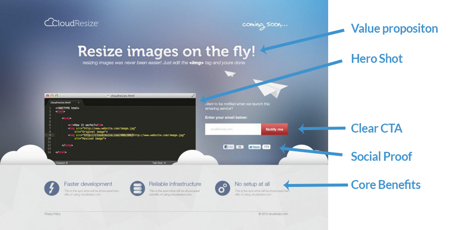
While ‘Coming Soon’ pages don’t necessarily follow this exact format, they should give users a sense of what your product is all about, why visitors should care, and a compelling reason to sign up for updates. In these next few sections, we’ll go over some ways that different brands approach this type of landing page.
Consider Adding Video
In this example from Google Calendar, they’ve decided to move away from the traditional ‘Coming Soon’ page model by building the focus around getting visitors to watch a video as the primary call to action rather than simply asking for an email address (though we get it, Google has the luxury of collecting data through other means).
We’ve talked about video landing pages before, noting that they are an effective strategy for driving conversions—be it a sign-up or a purchase, but Google does something slightly different, instead of embedding the video, they send users to a second location.
The Go-To-Market Playbook for Revenue Teams
The disconnect between sales and marketing is legendary. Here’s how to align these two teams for the benefit of your buyers… and the bottom line.
In the video, the Google Team highlights all of the features and benefits offered in the updated version of the tool—in more detail than the images found on the landing page. After watching the video, it’s hard not to want to download the app, even if you’re far from the organized self-starter who documents every meeting and event, no matter how minor.
While we wouldn’t necessarily change Google’s approach to the ‘Coming Soon’ page, we do recommend including a lead capture method front and center. Most companies don’t have the benefit of tracking users through a proprietary browser, so you’ll need to capture information the old-fashioned way.
Use it to Recruit
This example from Beet Nut has two primary functions—the first being, to generate sign-ups like a traditional landing page, while the second is as a means of recruiting staff to work at this new business.
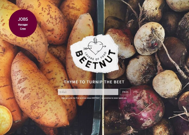
What they’ve done well here is, they’ve made an attractive landing page that uses imagery to give users a sense of what this business is all about.
That said, there are a few things that could be improved for a more impactful landing page experience. The first is, the CTA is rather small and doesn’t exactly stand out—we like the copy, as the “I’m in” implies that signing up means becoming part of a group or a movement, it feels inclusive. However, the button could be larger and it might be worth testing a contrasting color like a green or a sky blue.
The other issue we had here was there’s not a ton of information on the page that highlights what this company does. Sure, the root vegetables give us a pretty big hint, however, someone who hasn’t heard of this brand might not know if this company is launching a meal kit subscription, a grocery store, or a new farm-to-table style vegan restaurant.
Highlight the Value Prop
This landing page example from Lon (pronounced “loan” by the way) is short, sweet, and gets right down to business. You’ll notice that the headline immediately lets the visitor know exactly what this company is all about—they’re one of this new breed of online lenders that allow users to pay for items in installments.
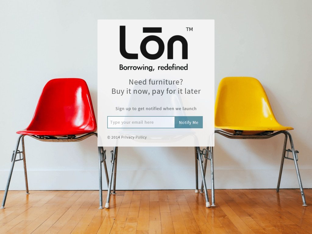
What we liked about this example is, it explains exactly what the service will provide, and doubles down with a tangible example—ordering furniture now, paying for it later. Overall, we wouldn’t change much about this ‘Coming Soon’ page, however, there is the question of whether or not this company offers loans that cover any online purchase or whether it’s exclusively designed for furniture—while the landing page copy focuses on furniture it isn’t 100% clear if that’s just an example of how people might use the service or if it’s the only option.
Consider the Beta Test
In this example from Cellar, a wine inventory management system, the page follows the traditional landing page format.
The focus is still on driving the sign-up and there’s a clear value proposition laid out in the heading and subheading. Users that want to learn more have the option to scroll further down the page to look at some of the features and benefits you’ll get from this tool.
On the customer side, they’ll get the chance to share their feedback with the company, which may help them ensure that the final result is the wine inventory-tracking system they’ve always wanted.
Wrapping Up
‘Coming Soon’ pages are a great way to grow your email list and start engaging with your audience before opening up shop, launching a product, or rolling out a redesign. While these pages aren’t exactly as conversion-oriented as say, your average e-commerce landing page or a page promoting a marketing book download, you’ll want to make sure you design your ”Coming Soon” pages with action in mind.
Make your CTA buttons stand out, embrace contrast, and keep a tight focus on your unique value proposition—you know, like a traditional landing page.
Not sure if your site is designed for conversions? Sign-up for a free 30-minute landing page assessment. We’ll look over your site, landing pages and all, and from there, we’ll give you actionable tips for achieving better results.