
Email gets a bad rap. It’s easily abused, and often, fails to come across as relevant or timely.
However, the game has changed. Today’s email marketing strategy is hyper-personal, non-linear, interactive—and one touchpoint in a larger, marketing ecosystem.
It also remains one of the best uses of your marketing dollars. At latest count, the medium returns an average of $44 for every $1 spent.
It’s also important to understand that emails need to step it up to make a good impression. Studies have found that over two-thirds of people understand information better when it is presented visually.
Here are some things that brands need to know about email design in 2019 and beyond.
Email Marketing Design Basics
Common wisdom suggests a 60/40 text-to-image ratio. The idea is that this proportion keeps you out of the spam folder. But, as you’ll see in some of the email template ideas we’ve included below, balance isn’t about achieving a certain ratio, it’s about delivering something of value to your subscribers.
That value might come in the form of a GIF that makes people laugh or a plain text email that gets right down to business.
Every element in your email should have a purpose and work toward one main goal. Balance means spacing out the text so that your audience can read it. It means images complement text and that there’s not an overwhelming number of visuals competing for your eyeballs.
Don’t Forget the Alt Text
Leave out alt text and users are treated to a blank box. Pretty unprofessional. Many users turn off images to prevent viruses or slow load times and without the alt text in place, they have no information outside of the text.

Optimize for Mobile
Pretty self-explanatory, but people check their email on their phones. An estimated 51% of emails are opened on a mobile device first, and that number is on the rise. People aren’t just opening emails on their phones, they’re also reading content and shopping for products.
While most email marketing tools automatically build responsive emails, you do need to keep a few things in mind.
Make Clear Who the Email is From
According to Campaign Monitor, 68% of Americans say they base their decision to open an email on the “from” name. The Topshop example here gives subscribes instant recognition–and if they’re fans of the brand, will entice them to check out what’s new in stock.

Where using the business name makes sense for brands like Topshop, it comes across as impersonal if you’re in the B2B space. Hubspot found that using a real person’s name versus the company name resulted in more clicks.
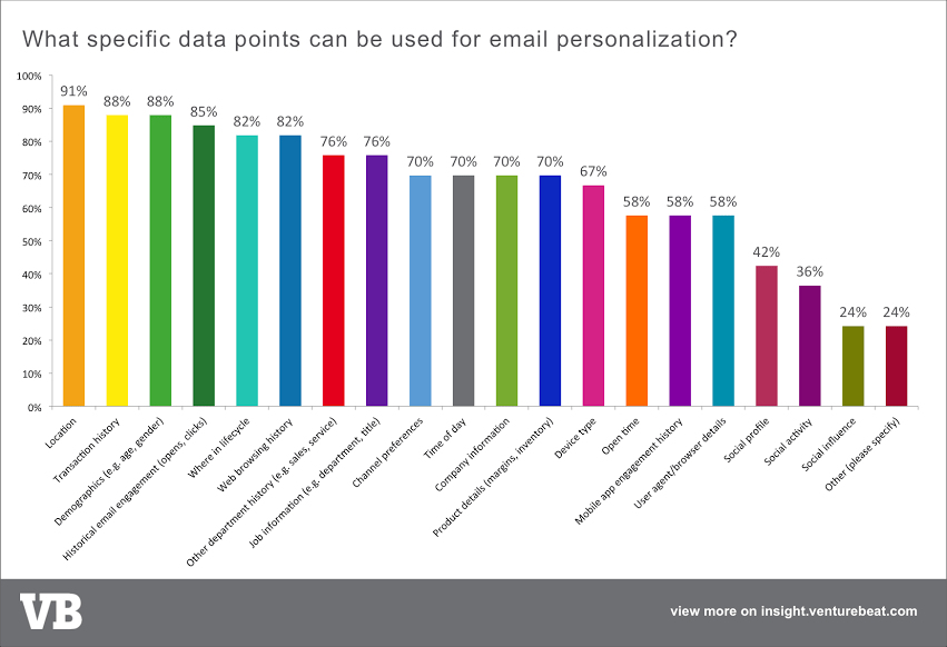
Embrace Dynamic, Personal Content
Dynamic content allows you to send targeted messages based on demographic information, behavior, interests, or any other data point. While this approach requires significant planning and a deep understanding of your audience, it’s a proven strategy for building trust with your audience and increasing sales.
All About Calls to Action
The CTA button is one of those tiny details that adds up to major results. An ideal CTA button has three main aspects that come together to drive action.
- Design— The button should stand out with a contrasting color, consider size, color, and the amount of white space surrounding it. Buttons should be large enough that mobile users can tap them easily.
- Placement—The CTA should be placed near the offer. In some cases, you may need to add a supplemental line to explain more about your value proposition.
- Copy—The content should tell users about a specific benefit. The A is for action—so, be sure you use an action verb that compels users to take the next step.
It’s also important to keep the number of CTAs to a minimum in your email. Focus on where you want people to go and remove any unneeded noise.
The number of buttons you have in an email is determined by how many actions are possible to take. In most cases, it’s better to keep it simple and present one clear offer at a time.
However, this depends on what you hope to accomplish with your email and your industry. Retailers might use multiple buttons to promote several items at a time.
You’ll see in this example that the email is personal and centers around a cohesive theme–bedding. There are multiple links to different products, but they are unified under one core idea.

Consider a Bulletproof Button
Many email clients block images from loading, so if you design CTA buttons as images, they’re basically useless. The solution is a small snippet of HTML and in-line CSS called a bulletproof button, which renders even when images are turned off.
Should You Use Email Design Templates?
According to Litmus, it takes the average email marketer up to 24.6 hours to build an email from scratch. For a medium that often goes unseen by recipients, that’s an awful lot of wasted time, especially if you consider that this average marketer needs to build up to nine emails at once.
So, templates present an attractive workaround. We recommend using templates for any type of email you send on a regular basis. For example, you might create an email nurture template like this for re-engaging past customers.

While today’s brands are starting to see the value in embracing one-off email designs, we recommend designing templates around a few core areas. While these areas will vary based on what your brand does, some examples include:
- Onboarding
- Cart abandonment
- Welcome messages
- Ongoing campaigns
Here’s some inspiration:

This is a good example of how you might build a long-term campaign around one idea, keeping design and brand elements the same, while featuring different customers.
GIFs and Animations
Animations and GIFs are claiming their space in the inbox, and according to Litmus research, increase ROI by 21%, on average. GIFs can be used to direct the reader to scroll or take action. Or, they can be used to add humor or personality to your email design.
While GIFs are certainly an effective way to liven up an inbox, beware of large files that can slow load times significantly. You’ll need to make sure you limit the number of frames, compress your files, and don’t add too many animations per email.
Go Graphic
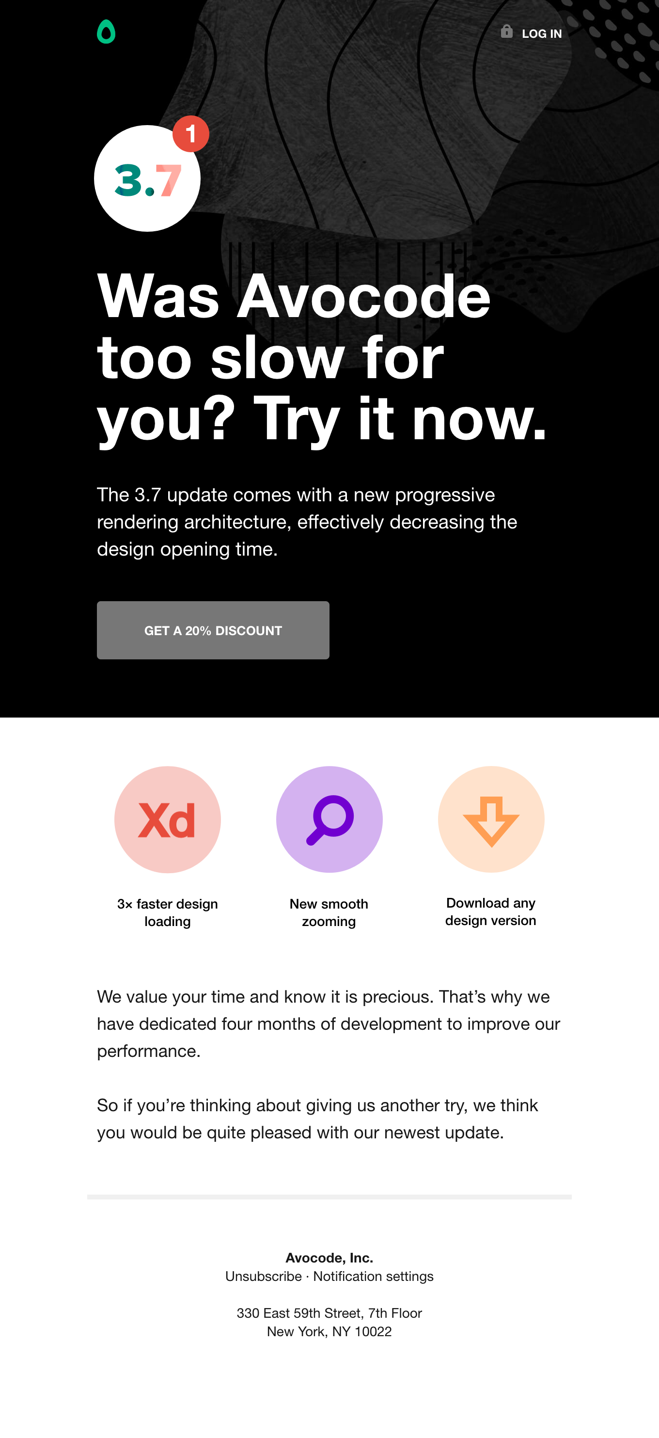
This email newsletter from Avocode is a winner for a few reasons. Design-wise, you have simple graphics, contrast, and plenty of white space. We also like the way the brand approaches its messaging. Yes, it’s a “come back” email, but it is short and instead of sounding desperate, highlights some new, likely welcome updates.
Unify With Color
Apple’s extra-long holiday email takes the brand’s signature white space aesthetic and balances it out by arranging its products in a way that they read as visual patterns. There’s a strong unifying effect at play, too, as the products all share the same color scheme.

Have Fun With Layouts
If your creative is a pure visual delight, it may only require a one-line introduction. This email from Mr. Porter is a creative take on the product flay-lay, which is a paper map that contains all the essentials a stylish man needs to go on vacation.
The message is clear and the playful map presents a clear path for the eye to move around the page.

Vans embraced bold color-blocking to show off a new shoe design. The result is an eye-popping contemporary design in just three colors.

The Case for Being Plain
Though the examples above are all about embracing color, composition, and your brand’s unique style, several studies have found that text-based emails often see more click-throughs and higher open rates. They’re also less likely to land in the spam folder.
Plain text isn’t as flashy as animated products or as visually compelling as bold colors and slick graphics, but it does offer a sense of simplicity to the user. It allows users to get what they need without feeling like they are being marketed to, and it feels more personal.
We actually use this approach quite a bit, it’s best suited for SaaS companies, B2B sales teams, and any other industries where a personal (human-to-human) approach is required.
Live Content
Email isn’t exactly the most “timely” communication method as most emails sit around in the inbox, waiting for someone to open them.
Live content presents a solution to emails gone cold—giving brands a way to bring users relevant content whether they open right away, wait a few days, or revisit a message multiple times.
Live content is on the rise in part due to AMP for email, which brings Google’s fast-loading HTML engine to the inbox. AMP allows users to quickly load content in the email instead of sending them to the web browser.
Instead, content is populated at the time of open, not during the design process, allowing brands to use elements like live polls, dynamic contests, quizzes, or short games to boost engagement with real-time information.
This poll from Bulk Powders capitalizes on the London Marathon. Results are updated in real-time and responses give the company data they can use to tailor future emails.
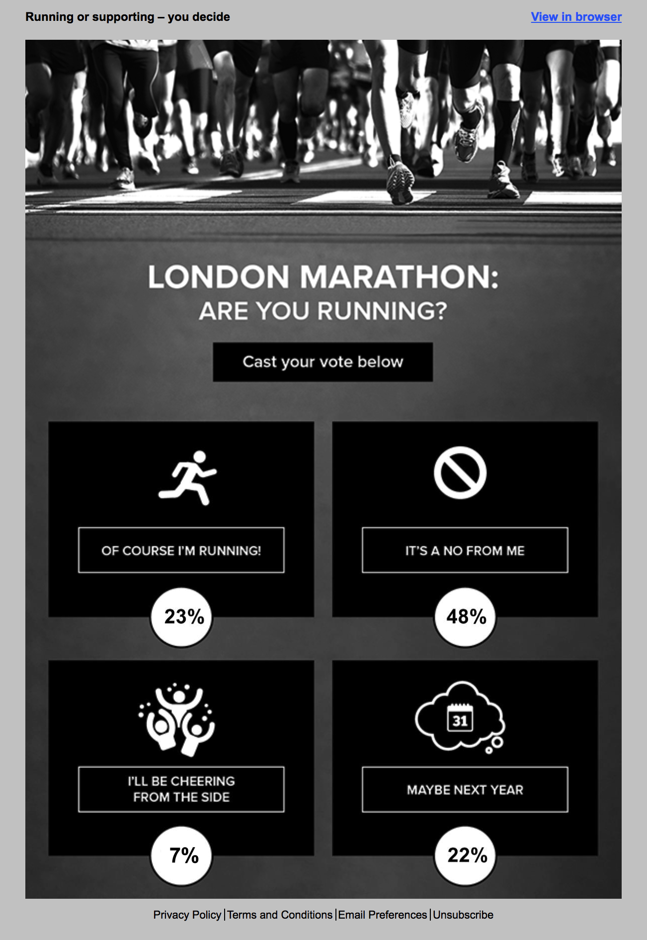
What’s more, live results can be set up so that they show something different with every view, which may encourage additional opens from the same customer.
Email Must Integrate with Other Campaigns
Breaking down silos is a workplace cliche at this point. However, we’re seeing this theme a lot these days as marketing campaigns go omnichannel. Where email marketing was once an isolated operation, it is now being used as part of a larger branding strategy.
Brands are moving toward creating copy for emails, socials, and ads at the same time—and creating a unified design they can execute across different channels.
The Essential Email Design Checklist
Designing emails that convert is easy if you check all the right boxes. Luckily, we’ve compiled a list of those boxes you can use as a reference as you update your email process. From copy and CTAs to links, footers, and compelling visuals, here are the key ingredients for a compelling email.
- Start with a Goal – Whether you’re writing a plain-text sales pitch or a visually-driven newsletter, make sure you’re aware of the goal and how it fits in with the rest of your marketing strategy.
- Write Compelling Copy – Be sure to follow brand guidelines, watch out for typos, and write to your audience.
- Use a Recognizable “From” Name – Whether you opt for the brand name or an individual employee is up to you. But, you’ll want to make sure that it’s immediately clear to the recipient that they know who the email is coming from.
- Spend Time on Your Subject Line – Subject lines should be short, sweet, and contain an actionable value prop. Ideally, the subject is about 4-7 words.
- Add Preview Text – Get right to the point. The preview adds context to your subject line and lets users know more about what they can expect to find inside.
- Order of Information – Place most important content toward the top and remember, people tend to read in an F formation. Refer to the inverted pyramid.
- Don’t Forget to Personalize – Personalized messages have been shown to increase click-through rates by 14% and conversions by about 10%. Name, location, and other demographic information should inform your campaigns.
- Heading Text – Headings should be at least 22pt font and body should be 14pt. Paragraphs should be short and broken into sections with subheadings for easy scanning.
- Email Width – Make sure email is between 600-640px.
- CTA Placement – CTAs should be positioned next to your offer and stand out to encourage clicks.
- White Space – Add white space around visual elements and blocks of text. This gives viewers some breathing room to process what you’ve given them.
- Optimize Images – Images should be relevant to content, strike a balance with text, and be optimized for quick load times.
- Add Contact Information – Make sure footers are consistent across all emails and contain your social accounts, address, phone number, website, or anything else users may need to know.
- Include the Option to Opt-Out – Place an unsubscribe link at the footer of the email.