As we’ve mentioned in a few recent, related articles, landing pages are custom web pages used to guide users through your sales funnel. The difference between a regular landing page and one built for the Facebook environment is that the latter is designed to provide more context for a Facebook ad or post.
When a user clicks on an ad, they’ll land on your Facebook landing page instead of the main website. Connecting your Facebook ads to the right landing page can make or break your success on the social media platform. Success depends on creating a cohesive experience that starts with the ad and continues post-click.
In this article, we’ll go over what marketers need to know about Facebook landing pages, so you don’t waste precious advertising dollars.
What a Facebook Landing Page Should Accomplish
Your Facebook landing page is where anyone who clicks on a Facebook ad will end up post-click.
The idea is, your ad should entice the reader to click through using a powerful CTA that drives action. After the click, you’ll want to present your audience with a bit more context for your offer. And ideally, generate enough interest to deliver more information that encourages them to make a purchase, answer questions, or leave some contact information behind.
Keep in mind; clicks aren’t everything. It’s easy to get excited when someone clicks your Facebook ad, but that’s only half the battle. Unless your landing page offers a clear path to your final goal, the campaign will likely eat up your marketing budget with nothing to show for it.
In any case, here are a few examples and best practices you can use as inspiration.
Never Send Users to Your Homepage
Like any campaign, if you’re using Facebook to generate leads or sell a product, sending users to your homepage is a bad idea, even if you’re making an introduction. Why? Because it’s too hard to track your efforts and prove ROI.
Here’s an example from WeWork that does a good job presenting key details at a relevant “second location.” The ad presents WeWork to people who likely haven’t tried the coworking solution yet, and for those compelled to learn more, offers a ton of details after the click.
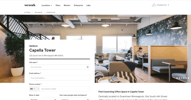
While most landing pages do better when they err on the shorter side, WeWork does a good job speaking to a specific person who wants to know exactly how their plans work before booking a trial.
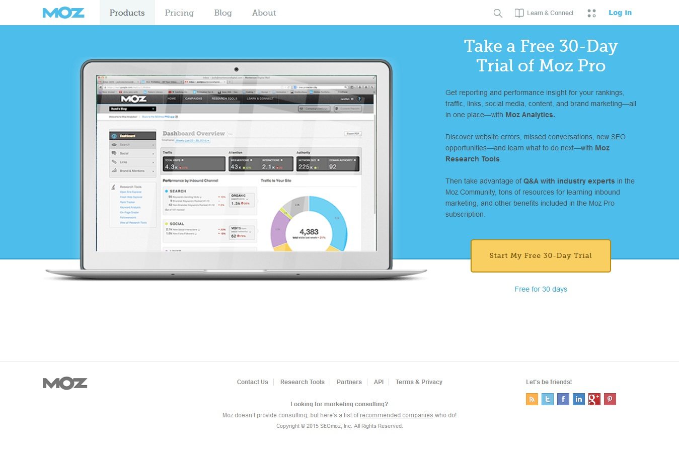
Or, there’s this example from Moz, which is centered around a totally different goal. In this case, it’s getting people to sign up for a free trial before they commit to the product. This page is short and sweet and highlights the core benefits of Moz without overwhelming newcomers.
Think About Intent
When constructing your Facebook landing page, think about your audience. What is it you want them to accomplish? Are you redirecting them back to your website? Are you entering them into a giveaway?
Knowing what your audience’s intentions are will help you address their needs more effectively. If you’re not sure, head back to the drawing board and dive deeper into your persona research and your customer journey map and jot down the main takeaway you’d like to impart at the beginning, middle, and end of the sales cycle.
As far as marketing objectives are concerned, Facebook’s Business Center offers a pretty solid explanation for different advertising goals. They’ll break down what kinds of ads work best for top-of-the-funnel lead generation versus mid-funnel consideration campaigns. They’ll also highlight which ad formats work best for brands hoping to increase reach, boost awareness, or get high-intent prospects to finally convert.
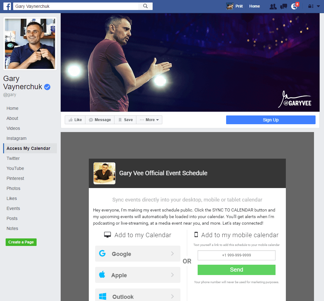
Here’s an example from digital entrepreneur, Gary Vaynerchuk. This Facebook landing page speaks to people who already follow Gary and want to keep up with his latest digital events. In this case, his goal is likely to retain followers and nurture a relationship with his fans. If he were aiming to reach a new audience, then the landing page might come with more information about who he is, what he does, and why you might want to follow him.
Headlines and Ad Offers Should Be a Close Match
When directing ads to a Facebook landing page, one of the most important things to consider is matching the offer on both sides of the click.
For example, if the offer is, “Subscribe here for a chance to win a $500 gift card,” it should say so in both the ad and at the top of the landing page.
Here’s the thing–what may seem obvious to you might not come across the same way to your reader who has happened upon your content for the first time. If your ad says “gift card,” but the landing page says “e-book” there’s a mismatch at play, which creates confusion for the reader.
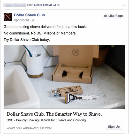
Here’s an example from Dollar Shave Club, which starts by promising a great shave at a great price point in the in-feed ad.
Then, you’ll head over to the landing page, where you’ll get more specifics about what it means to be part of the club. From there, if you like what you see, you can sign up for a plan and check out.

While the message match is tight, the visuals could be more tightly linked, as the photos used on the ad and the landing page have a slightly different look and feel. Because you’re stuck with Facebook’s branding in the in-feed ads, you may want to take extra care to match the other visual elements to reinforce consumer perception of your brand. It’s a small detail, but unknown brands can benefit by taking it seriously.
Make Sure the Facebook Landing Page Highlights Your USP
Another key ingredient in your Facebook landing page? Your unique selling proposition, or USP.
As a quick refresher, your USP is your way of showing visitors what defines your business and makes it different than what your competitors are doing.
Whatever the goal of your Facebook landing page is, the emphasis should be the USP–if a visitor can’t quickly identify why they should pick you over another brand, then you haven’t presented your USP clearly.
Here’s an example from Jeep. What they’ve done well here is, they’ve presented a clear offer–earning points by joining a community of “off-roaders.”
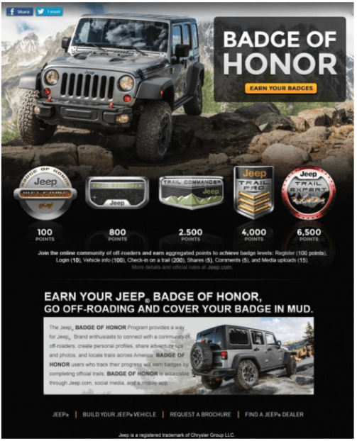
Within that offer, the imagery, and the copy, the USP shines through. Jeep is different than say Honda or BMW, as it caters to an outdoorsy customer and is designed for rugged terrain. Sure, it’s a car, but it taps into a specific identity and a set of interests that might not resonate with someone looking for a commuter car or a luxury driving experience.
While Jeep has really nailed down their target personas, this landing page layout could be a bit more focused and the CTA could be a bit bigger. The messaging is clear but the lack of headers and the small CTA makes it difficult to understand what the next step should be.
Wrapping Up
Whether you’re generating leads with a free e-book, promoting a subscription offer, or selling a product, your Facebook landing page is your opportunity to seal the deal with your audience in a competitive social media landscape.
If you fail to get this critical element right, leads will slip away and you’ll waste significant marketing dollars.
Ready to Start Making Money from Facebook Landing Pages?
Download our free guide on how to use conversational selling to maximize return from your ad spend. Click the link below to get your free guide!
The Conversational Sales Handbook
Learn how to convert buyers on your site to revenue with Conversational Sales.