
One of my favorite marketing quotes is from Peep Laja of CXL. He wrote, “Other people’s A/B tests are other people’s solutions to other people’s problems. Your website has specific problems, not generic problems.”
This has always framed how I approach conversion rate optimization (CRO), especially landing page optimization. Other people’s landing pages are other people’s solutions to other people’s problems. There’s no sense in copying their messaging, their design or their calls to action (CTAs).
Hell, what works on one of your landing pages might not work on your new landing page. So, why would you turn to a competitor for direction?
Instead, turn to your own problems through conversion research. Here’s the step-by-step guide to solving your specific and contextual landing page problems.
What is a landing page?
A landing page is a web page purposefully crafted to convert visitors into leads or customers. Often, marketers will use what is known as a “dedicated landing page”, which promotes one specific offer to one specific audience. For example, here’s a dedicated landing page for Drift Insider:

You’ll notice there’s no main navigation, there’s one value proposition and there’s one promoted next step (“SEE DRIFT ON YOUR SITE”). It is, well, dedicated.
Let’s say you’re running a Facebook ad campaign to promote Drift Insider. Sending the traffic from that campaign to this high-awareness, dedicated landing page will offer a stronger messaging match than dropping that traffic on the lower intent, more generic homepage, for example. The same concept applies to email campaigns, organic search campaigns, etc.
However, every web page is technically a landing page, dedicated or not. Your homepage is a landing page. Your help pages are landing pages. Your team page is a landing page. If visitors land on it, it’s a landing page and it can be optimized to convert more of those visitors into leads or customers.
The Step-by-Step Guide to Landing Page Optimization
There are, of course, best practices for this. For example:
- Use CTAs with high-contrast so that they visually stand out from the rest of the page.
- Keep the CTA above the fold, meaning visitors don’t have to scroll to see it.
- Sell benefits, not features in your landing page copy. For example, Apple famously sold “1,000 songs in your pocket” (benefit) vs. the specific, technical capacity (feature) of the original iPod.
This list could go on forever.
Best practices are best practices for a reason: they work for a lot of marketers a lot of the time. But they are not perfect and they are not scientific. Sometimes having fewer form fields is a bad idea, even if it increases top of funnel conversion metrics. Sometimes putting your CTA above the fold won’t make a difference. Sometimes removing the main navigation will decrease conversions.
CRO is highly contextual. So, sure, be aware of best practices and even use them to inform some hypotheses about how you might optimize for more conversions on your specific landing page for your specific audience, but don’t rely on them as an absolute truth.
So, what can you rely on as an absolute truth? Your own conversion research.
Step One: Define Your Value Proposition and Messaging
Before you dive in, you have to define your value proposition, which is the value you promise to deliver post-conversion. It’s the reason people buy from you and not one of your competitors. The most effective value propositions are exclusive, specific and pain-focused.
To narrow in on your value proposition, ask yourself:
- What does my product or service do that is both desirable and exclusive? Which benefits are my competitors afraid to compete with me on?
- How, specifically, does the customer benefit from purchasing from me?
- Which pains and problems does my product or service solve for people? How?
Conversion research can help you answer those questions (and more). Drift has a guide that goes into more detail on the conversion research process, but here’s a brief overview of the different quantitative (data-driven, the “what”) and qualitative (people-driven, the “why”) research methods available to you:
- Analytics Analysis: Are you collecting all of the data you need? Is the data you’re collecting complete and accurate? Does your site work properly on every browser and on every device?
- Heatmaps: Scrollmaps show you how far down a page your visitors scroll. Clickmaps show you where your visitors click on your page.
- Heuristic Analysis: Heuristic analysis is the process of personally evaluating a site for usability issues and optimization opportunities.
- Surveys: An on-site survey appears to site visitors either after a set period of time or when exit intent is shown. A customer survey is sent out, typically via email, to paying customers.
- Interviews: Interview support and sales staff to identify common customer questions, frustrations, pain points, benefits, and objections. Then interview customers for voice of customer copy, product ideas and experiment ideas.
- User Testing: User testing allows you to watch as someone interacts with your site, often narrating their thoughts as they go.
- Session Replays: Session replays allow you to watch as real potential customers with real intent to spend real money interact with your site.
Talia Wolf of GetUplift agrees that nailing your value proposition is essential, adding the importance of aligning that value proposition with state of awareness:
“A successful, high-converting landing page addresses one single visitor and delivers one promise to them.”
To master this, you will need to:
- Figure out the state of awareness of your landing page visitors.
- Figure out what their goal is.”
When you think about awareness, it helps to consider the five stages that Eugene Schwartz suggests in Breakthrough Advertising:
- Completely Unaware: They have, you guessed it, no awareness.
- Problem-Aware: They are aware of the problem, but not the solution.
- Solution-Aware: They are aware of the problem and solution, but not your product or service.
- Product-Aware: They are aware of the problem, solution, and your product or service, but they aren’t sure if it’s right for them.
- Most Aware: They are aware of the problem, solution, and your product or service, and they’ve already decided it’s right for them.
If you don’t know which stage of awareness you’re speaking to, you can’t craft an effective value proposition for your landing page.
There’s a strongly-held belief in some communities that blogs don’t convert well directly, for example. Is that really true? Or are marketers writing productivity articles to grab that sweet, sweet organic search traffic and then slapping a product demo CTA for their analytics tool at the bottom of the article?
Your value proposition and CTAs need to align with the current stage of awareness, or you’ll be leaving conversions on the table.
Step Two: Design an Intuitive User Experience (UX)
There are two things to remember here:
- Copy always dictates UX. This is a hill that I will die on. Make sure you’ve really thought about your value proposition and messaging before moving on to this step.
- UX and design are not synonyms. Design is just one aspect of UX, which also includes accessibility, speed, etc.
UX serves two purposes on a landing page. First, support and amplify the messaging. Second, don’t make things harder than they have to be. Seriously. It’s celebrated when it’s intuitive and, for lack of a better word, unnoticeable. But it’s condemned when it’s clunky and broken.
Above all else, great UX is functional. If your landing page doesn’t meet expectations and work the way visitors expect it to, it won’t convert. Too slow? That’s a problem. Broken on Internet Explorer 5? That’s a problem. Doesn’t fit on an iPhone 6 screen? That’s. a. problem.
It’s easy to get sucked into new design trends that look nice, but reduce ease of use. Instead, lean into prototypes (e.g. most ecommerce stores have the cart icon in the top right-hand corner) and familiar design patterns (e.g. iconography).
Take Unbounce, for example:
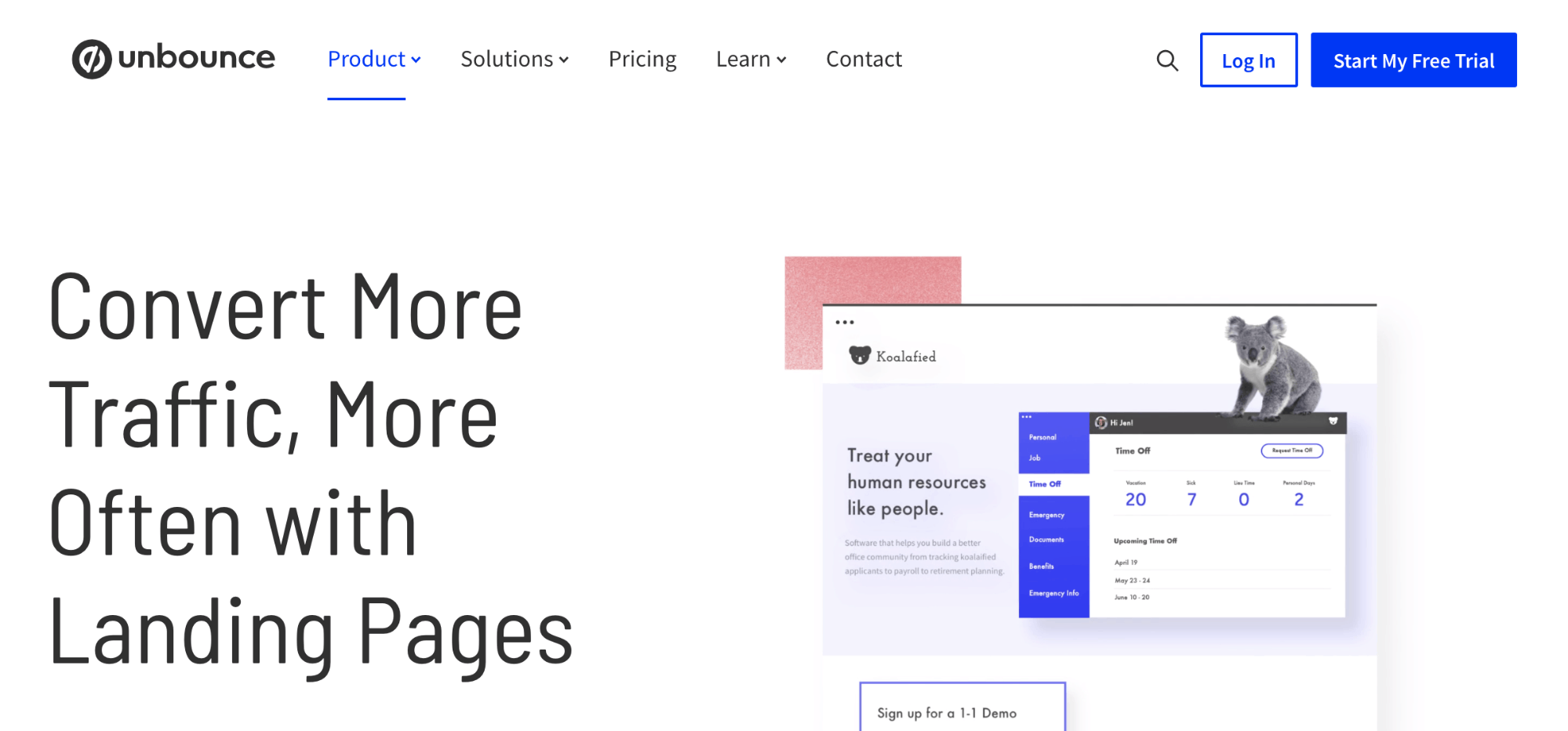
What do you think will happen when you click the magnifying glass icon?

It’s familiar, it’s expected, it’s functional—it’s good UX.
Two elements of UX that are particularly important on landing pages are: web forms and CTAs. Be sure to:
- Remove as much of the suck from filling out the web form as humanly possible. Don’t ask for information you don’t intend to use. Clearly label your fields. Offer help messaging if you think visitors will have questions about certain fields. Offer validation or error messaging in real-time, as the form is completed. Allow for autocomplete, where possible. Ensure you’re offering the right keyboards for mobile devices.
- Rely on quantitative form analytics. You can use a form analytics tool, like Formisimo to measure: form views, form starters and starter rate, conversions and conversion rate, abandonment rate, average correction rate, failure rate by device, average form interaction time, top converting paths, top abandoning paths, and more. This will tell you specifically where visitors are struggling (i.e. where your form’s suck is).
- CTAs should be RAINCCCTT. (In my head, this is pronounced “ranked”.) That is: relevant, active, indicative, noticeable, clear, concise, consistent, timely, and targeted.
- CTAs are more than just buttons. Typically, when you think of CTAs, you think of links or buttons. However, a strong CTA combines surrounding elements as well. For example, the heading and the imagery.
During your conversion research in step one, you probably stumbled upon UX issues. Prioritize them based on the anticipated impact and effort, and slowly work through them.
As Alex Birkett of HubSpot explains, landing page UX is an exercise in practicality, not unbridled creativity:
The most costly mistake I see is building custom pages and modules when a template could get you 90% of the way there, or repeatedly building different pages for different campaigns when you could templatize things and create design changes based on either the universal or the specific page depending on which needs to be done. Luckily, most landing page builders have eliminated this type of redundancy, which allows marketers to focus on more important and meaningful aspects of landing page optimization, like strategy and creative.
– Alex Birkett, HubSpot
If UX seems simple and straightforward, that’s because it is. Not easy, but simple. There’s an important difference between the two. However, mobile UX is a different beast.
In recent years, many marketers have resigned to the notion that “responsive design” is “mobile optimization”. In other words, taking the desktop version and scaling it down for mobile screens is mobile optimization. Of course, that’s just not true.
Mobile is an entirely different user experience. We, as marketers, know this! We know that mobile and desktop traffic behaves differently, so why are we still trying to optimize those two different experiences the same way?
Here are a few things to keep in mind:
- Don’t ignore mobile functionality, take advantage of it. Pinch-to-zoom, custom keyboards, mobile wallets, etc.
- Do the thumb test! Can you tap your CTA with one hand?
- Allow visitors to save their progress and continue on another device, if they want to.
- Friction can feel even more overwhelming on a smaller screen. Make sure you’ve reduced the number of steps it takes to unlock value.
Step Three: Run Tests and Experiments
Combine messaging and UX, and you’ve got yourself a landing page! But the great thing about landing page optimization is that there’s always room for improvement. That’s where testing and experimentation comes into play.
For the sake of simplicity (and our mutual sanity), let’s focus on A/B tests using frequentist statistics. That means we’re going to test two versions (the existing version, known as the “control”, and the variation) of the landing page against one another.
First, we need to calculate our sample size, which is how many people the test will need to reach. Don’t worry, there are free calculators you can use to spare yourself the mental math. Here’s an example:
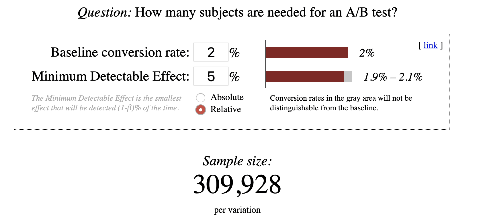
In this example, your baseline conversion rate is 2%. In other words, 2% of the people who visit your landing page convert to customer. Your minimum detectable effect is 5%. That is, the effect must be 5% or greater for you to detect it.
The required sample size, as you can see, is 309,928 per variation.
Now, if you were to reduce your baseline conversion rate to 1%, that 309,928 jumps to 626,231. Similarly, if you want to detect a smaller effect, say 3%, on the original 2% baseline conversion rate, that 309,928 jumps to 858,416.
You might be thinking that eventually 309,928 visitors will see each of your variations. The problem is that the longer a test runs, the higher the risk of sample pollution is. Sample pollution is simply the external factors that influence the validity of your test results. The list is virtually endless, but here are a few examples:
- For example, visitors behave differently during BFCM (Black Friday and Cyber Monday) than they do in mid-June.
- Device switching. When a mobile visitor returns later on a desktop, there is a chance they will be shown a different variation on desktop than they were originally on mobile.
- Cookie deletion. When cookies are deleted, visitors will re-enter the test and may be assigned into a different variation.
- Campaign launches. For example, if the paid search team turns on a $2M campaign in the middle of your test, you can assume that will skew the results.
Sample pollution is the reason you can’t simply leave a test running for 7 months while you satisfy the sample size requirement. Typically, you want to be able to reach your required sample size within two business cycles, which is 2-4 weeks for most businesses.
As Alex explains, every test you run is an opportunity cost:
The most expensive mistake marketers make with landing page optimization is in relation to inefficiency, or rather, not prioritizing their actions based on the impact or ROI. Tactically, this could fall into many buckets, the most common being the ‘test everything’ ethos that leads CRO experts to make fun of CTA button color tests. It’s not so much that button color tests are silly in general; they can bring results given a sufficient population. It’s that, given all the other things you could be doing with your time, turning a button from blue to red is likely to be one of the lowest possible impact things you could do. It’s an expensive opportunity cost.
– Alex Birkett, HubSpot
So, let’s start generating some high quality, relevant traffic, shall we?
Wait. What?!
Sure, you could generate as much traffic as possible by whatever means necessary. Or, you could generate traffic with a higher level of awareness and a higher level of intent (i.e. traffic that’s more likely to convert). Why invest, financially or otherwise, in traffic that will bounce faster than it arrived?
High quality, relevant traffic can be generated in two ways: paid and organic.
With paid, the investment is financial. This is your paid search campaigns, your Facebook ad campaigns, etc. Your credit card gets charged and traffic starts appearing.
With organic, the investment is time and energy. This is your podcast, blog, organic search, etc. You have to invest non-monetary resources and practice patience.
On Landing Pages and Organic Search
Landing page search engine optimization (SEO) is an interesting challenge because many landing pages are seasonal or temporary. For example, you might create a landing page for a BFCM campaign. But once the big days come and go, you won’t have a use for the landing page until next year.
While you’d love for your BFCM campaign landing page to rank first for “otter tophats” when BFCM rolls around so you can capture that sweet, sweet high-intent organic search traffic, it can be difficult to justify the investment.
Similarly, many landing pages are designed for specific paid campaigns. Since paid and organic traffic behaves differently, it’s difficult to optimize a landing page for both at once. So, paying attention to SEO for your landing page might not be relevant at all (i.e. the page might be no-index).
If your landing page is sticking around for a while and you want Google (or any other search engine, for that matter) to rank it well, here are a few quick tips:
- First, decide if you want to target commercial keywords (e.g. “buy otter tophats”) or informational keywords (e.g. “DIY otter tophats”). Align this with your awareness stage and understanding of visitor intent level.
- Brainstorm a list of keywords, leaning on suggested searches from major search engines like Amazon and Google for inspiration. Google Keyword Planner will tell you how popular those keywords are and how difficult it will be for you to rank for them.
- It’s 100% possible to go too far down the SEO rabbit hole. While trying to please the algorithm overlords, you can displease the actual humans who will pay your bills. Be careful not to overdo it.
- Tastefully include keywords in your page title, meta description, heading tags, alt text, URLs, etc.
- Dedicated landing pages, especially for paid campaigns, tend to be light on copy. These are known as “thin” pages, which can be difficult to rank because Google doesn’t have a lot to go on. Be sure your landing page isn’t too thin.
- Adhere to accessibility standards. It’s the right thing to do and there’s evidence that Google rewards accessibility.
You may want to use your conversion research to figure out where your existing customers are hanging out online. What channels did they arrive from? What channels do they use in their free time? What channels do they use in a professional setting? This can help inform your traffic acquisition strategy.
Neither paid nor organic is inherently superior. Ideally, you use a mix of both. Finding that balance and ideal investment level across all channels is a unique process for every company.
To narrow in on that balance faster, run channel-level tests and experiments as well. For example, you might test two paid search campaigns against one another. Which sends the highest quality traffic? Or you might test two organic keywords against one another.
You’ll have to be careful they don’t interfere with any of your on-site results, though. If you’re not aware of the ways the two tests may interact with one another, it can invalidate the results of both tests.
Above all, as Dana DiTomaso of Kick Point explains, evaluate your landing page tests (and overall success) by bottom of the funnel metrics:
“I’d say the biggest mistake is not tracking anything beyond pageviews and conversions. Otherwise, you won’t know the actual reason why your page isn’t converting as well as it should or, conversely, why it’s doing awesome so you can learn things to apply to other pages.”
Conclusion
I know what you’re thinking: this seems a whole lot more complicated than getting an Unbounce subscription, using the same template as your top competitor and calling it a day.
And truthfully, it is.
Landing page optimization tools have made it incredibly easy to create landing pages in seconds, much like testing tools have made it incredibly easy to launch A/B tests. But that convenience doesn’t negate the fact that you have to develop a strategy and, well, actually do the optimizing.
An incredible amount of work goes into turning 3-5 elements on a single web page into a high-powered conversion machine.
The good news is that you’ve already taken the first, and most important, step: realizing that you have specific problems that need specific solutions. Congrats!